Lec:——–
ここでは、凡例の内容の操作について解説していきます
── Attaching core tidyverse packages ──────────────────────── tidyverse 2.0.0 ──
✔ dplyr     1.1.2     ✔ readr     2.1.4
✔ forcats   1.0.0     ✔ stringr   1.5.0
✔ ggplot2   3.4.2     ✔ tibble    3.2.1
✔ lubridate 1.9.2     ✔ tidyr     1.3.0
✔ purrr     1.0.1
── Conflicts ────────────────────────────────────────── tidyverse_conflicts() ──
✖ dplyr::filter() masks stats::filter()
✖ dplyr::lag()    masks stats::lag()
ℹ Use the conflicted package (<http://conflicted.r-lib.org/>) to force all conflicts to become errors
graph <- ggplot(diamonds) + geom_histogram(aes(x = price, fill = clarity))
graph
`stat_bin()` using `bins = 30`. Pick better value with `binwidth`.
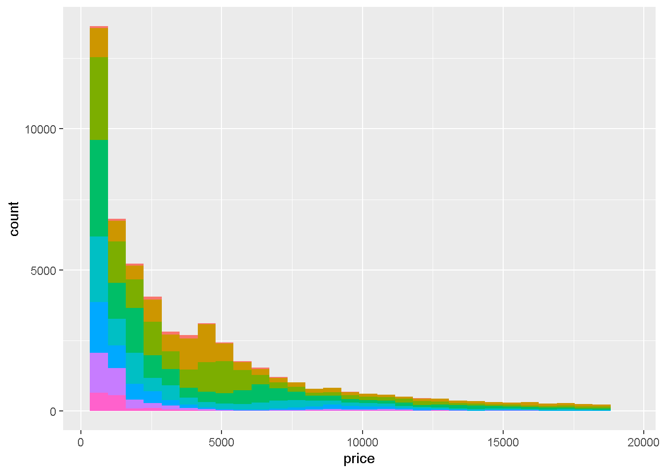
まずは、スライドではでてきませんでしたが、凡例をけしてみましょう guide = FALSEとすることで表示をなくすことができます。
graph + scale_fill_discrete(guide = FALSE)
`stat_bin()` using `bins = 30`. Pick better value with `binwidth`.
Warning: The `guide` argument in `scale_*()` cannot be `FALSE`. This was deprecated in
ggplot2 3.3.4.
ℹ Please use "none" instead.
guideは初期設定がTRUEで表示されるようになっているため特に指定しなければ消えないので安心してください。
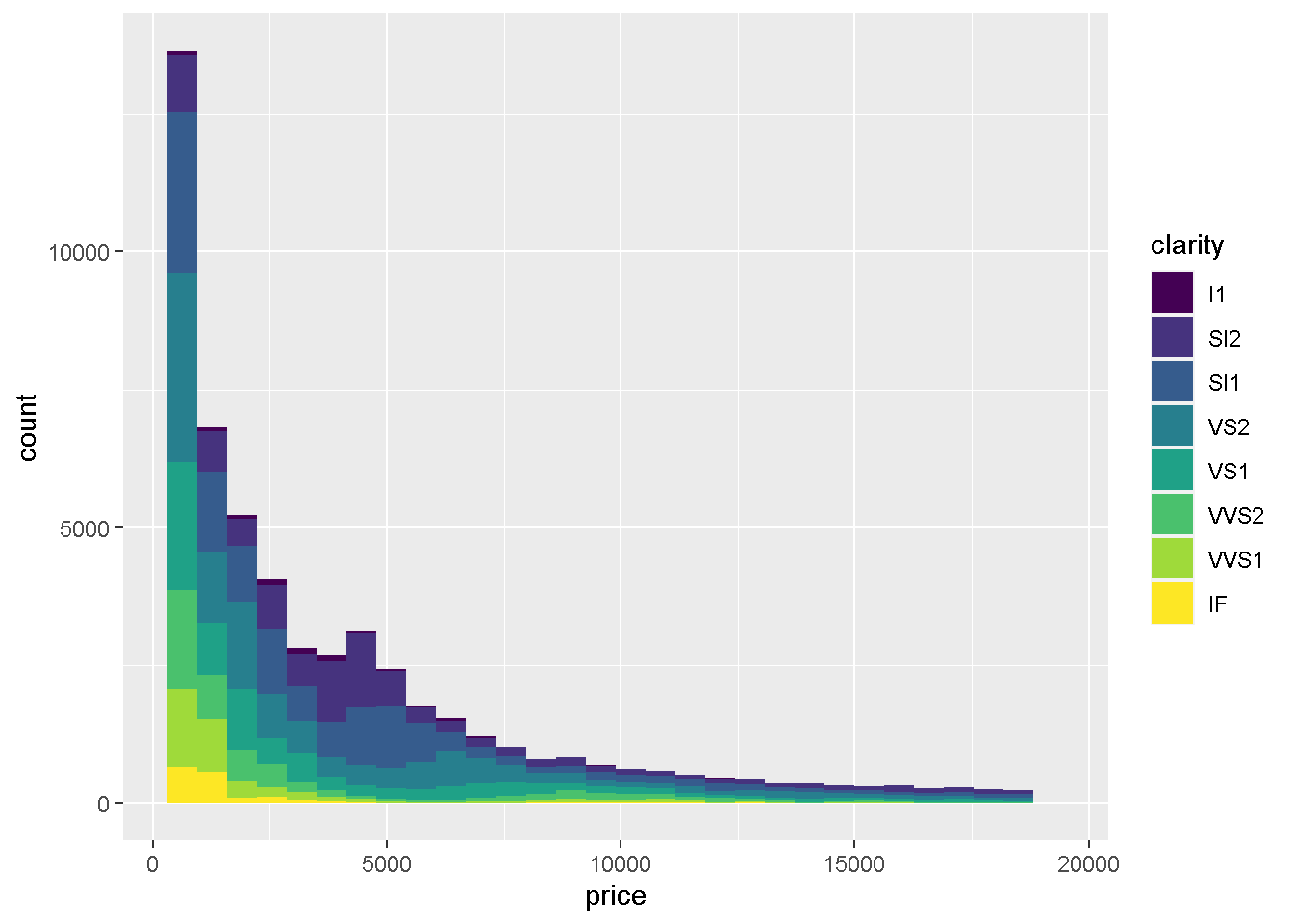
次にタイトルを変えてみましょうnameに変更したい文字列を与えてあげるだけでOKなので、
`stat_bin()` using `bins = 30`. Pick better value with `binwidth`.
graph + scale_fill_discrete(name = "透明度")
`stat_bin()` using `bins = 30`. Pick better value with `binwidth`.
かわりましたね?
次に表示される順番を変えてみましょう。
starting httpd help server ... done
一応、I1が最悪で、IFが最高の透明度らしいです。現状は、
summary(diamonds$clarity)
   I1   SI2   SI1   VS2   VS1  VVS2  VVS1    IF
  741  9194 13065 12258  8171  5066  3655  1790
と、Ord.factor 最悪から最高までの順番でちゃんとならんでおります
Ord.factor w/ 8 levels "I1"<"SI2"<"SI1"<..: 2 3 5 4 2 6 7 3 4 5 ...
をみてみると、実はこの変数、これまで解説していないOrd.factorという、因子型に順番が設定された変数となっております。
Legendの表示順は原則アルファベット順なのですが、順番を指定した因子型にすると、順番通りに並べてくれるので、便利です。ただ、現状ではとりあえず、そんなものがあるんだなあくらいの認識でいてもらってよいかと思います。
`stat_bin()` using `bins = 30`. Pick better value with `binwidth`.
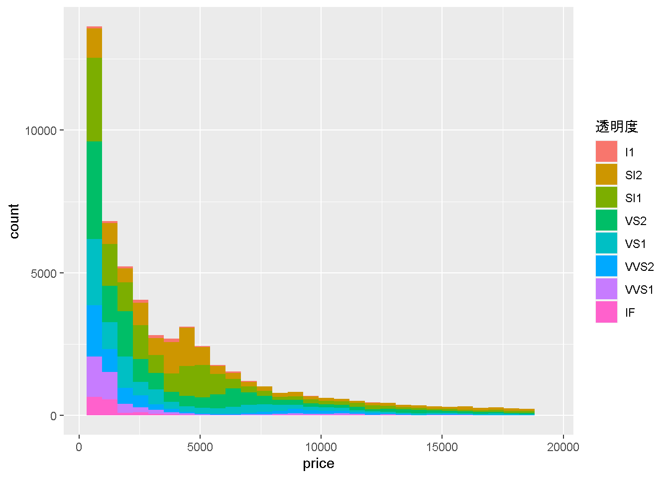
グラフの描画でもこの順番に上からならんでいます。ここでは、最高から最悪まで表示されるように順番を入れ替えてみましょう
new_order <- c("IF","VVS1","VVS2","VS1","VS2",
               "SI1","SI2","I1")
このnew_orderをscale_fill_discreteのbreaks に与えてみます。
`stat_bin()` using `bins = 30`. Pick better value with `binwidth`.
graph +
  scale_fill_discrete(breaks = new_order)
`stat_bin()` using `bins = 30`. Pick better value with `binwidth`.
こんな感じでIFを一番上にすることに成功しました色合いが実はOrderedFactorそのままの場合と、順番を分けた場合に変化しています。本コースでは、基本的なところをお伝えする方針なため、色を個別に変更するところまでは踏み込みませんのでその点、ご了解いただけますと幸いです。
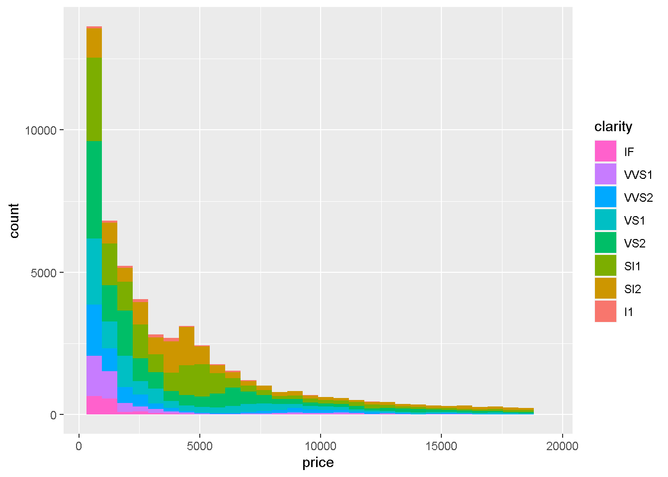
最後に、Legendに表示される内容にラベルをつけてみましょう。
ダイヤモンドの透明度について知らないので、調べてみると、
透明度とは、ダイヤモンドに含まれる微少な包有物
- I1:含まれる
- SI2:わずかに含まれる
- SI1:わずかに含まれる
- VS2:ほんのわずかに含まれる
- VS1:ほんのわずかに含まれる
- VVS2:ごくごくわずかに含有
- VVS1:ごくごくわずかに含有
- IF:内部が無傷
という説明になっているので、ラベルをつけます
[1] "I1" "SI2" "SI1" "VS2" "VS1" "VVS2" "VVS1" "IF"
で表示された順番に、
text_label_of_clarity <- c("含まれる",
                           "わずかにSI2","わずかにSI1",
                           "ほんのわずかにVS2","ほんのわずかにVS1",
                           "ごくごくわずかにVVS2","ごくごくわずかにVVS1",
                           "内部が無傷")
という文字列ベクトルを作成してあげて、
`stat_bin()` using `bins = 30`. Pick better value with `binwidth`.
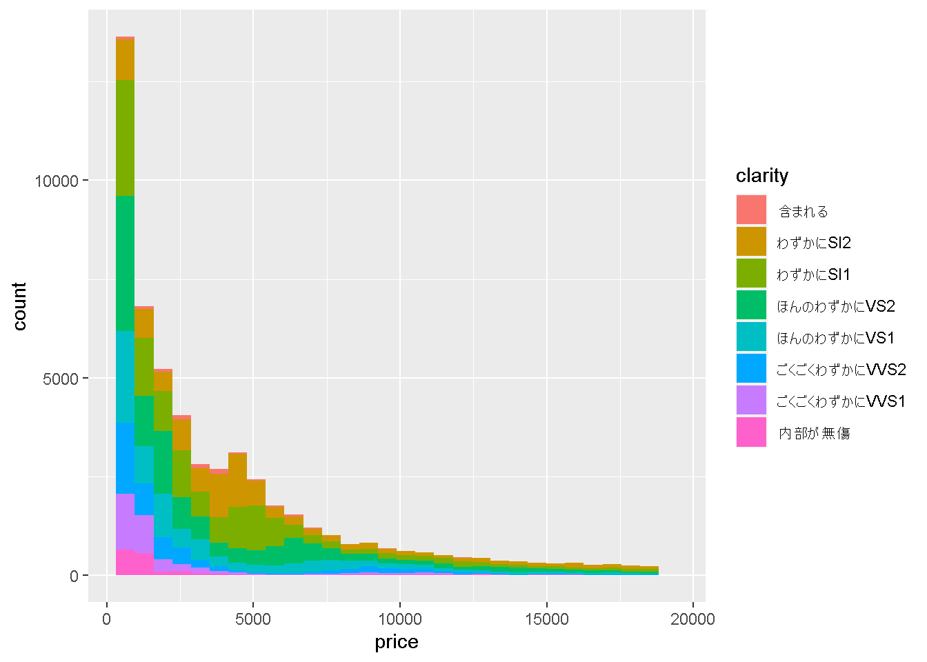
graph + scale_fill_discrete(labels = text_label_of_clarity)
`stat_bin()` using `bins = 30`. Pick better value with `binwidth`.
とすることで、表示名も変更できました!
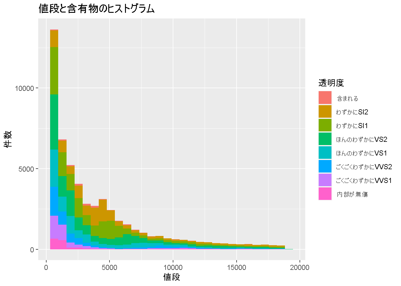
ここまで学んだ情報をまとめて記載すると、
ggplot(diamonds) +
  geom_histogram(aes(x = price, fill = clarity)) +
  labs(title = "値段と含有物のヒストグラム", x = "値段", y = "件数") +
  scale_fill_discrete(name = "透明度",
                      labels = text_label_of_clarity)
`stat_bin()` using `bins = 30`. Pick better value with `binwidth`.
こんなグラフがかけるようになりました!
お疲れさまでした! 次は演習問題を解いていきましょう。